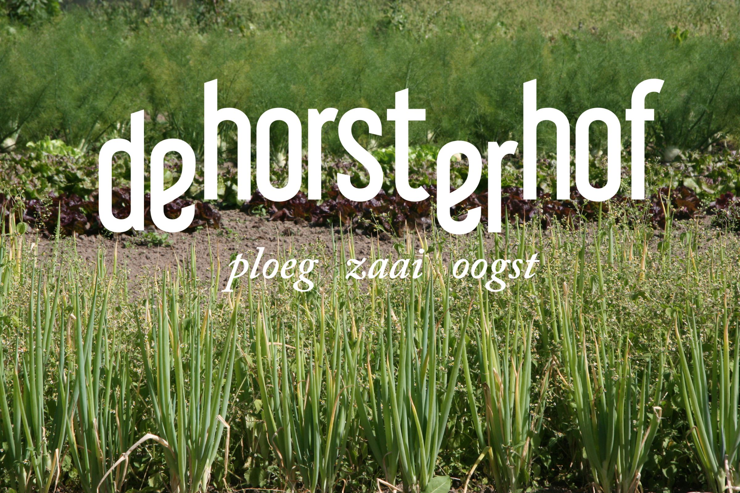
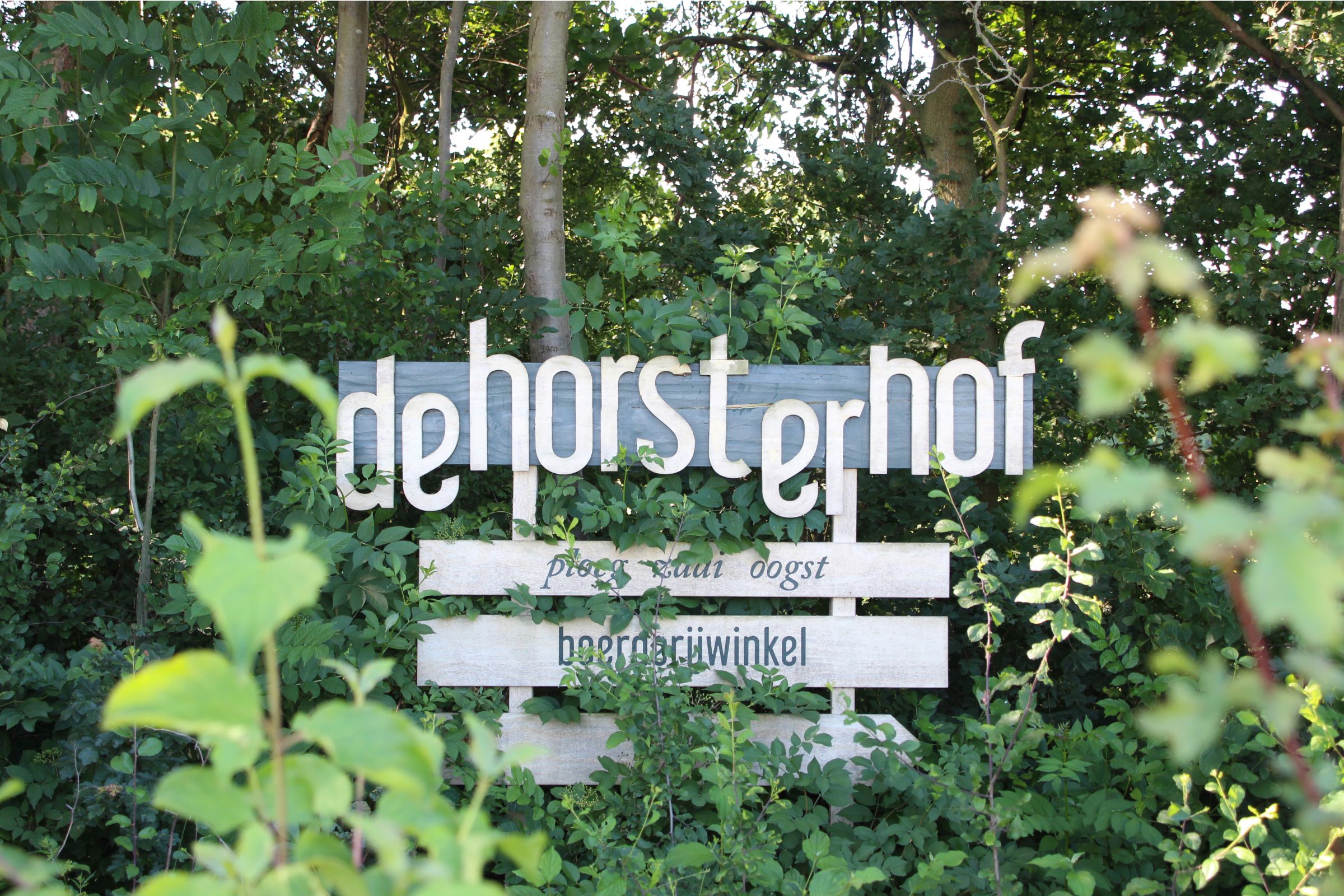
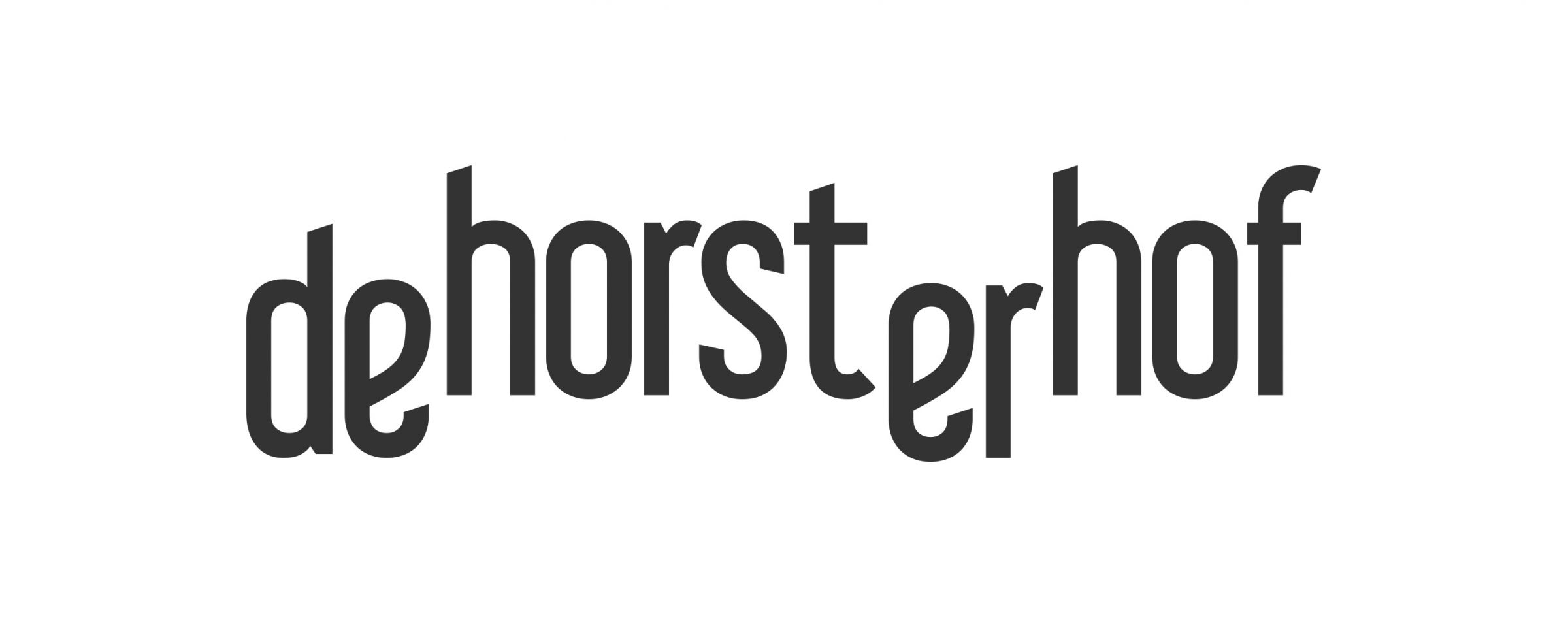
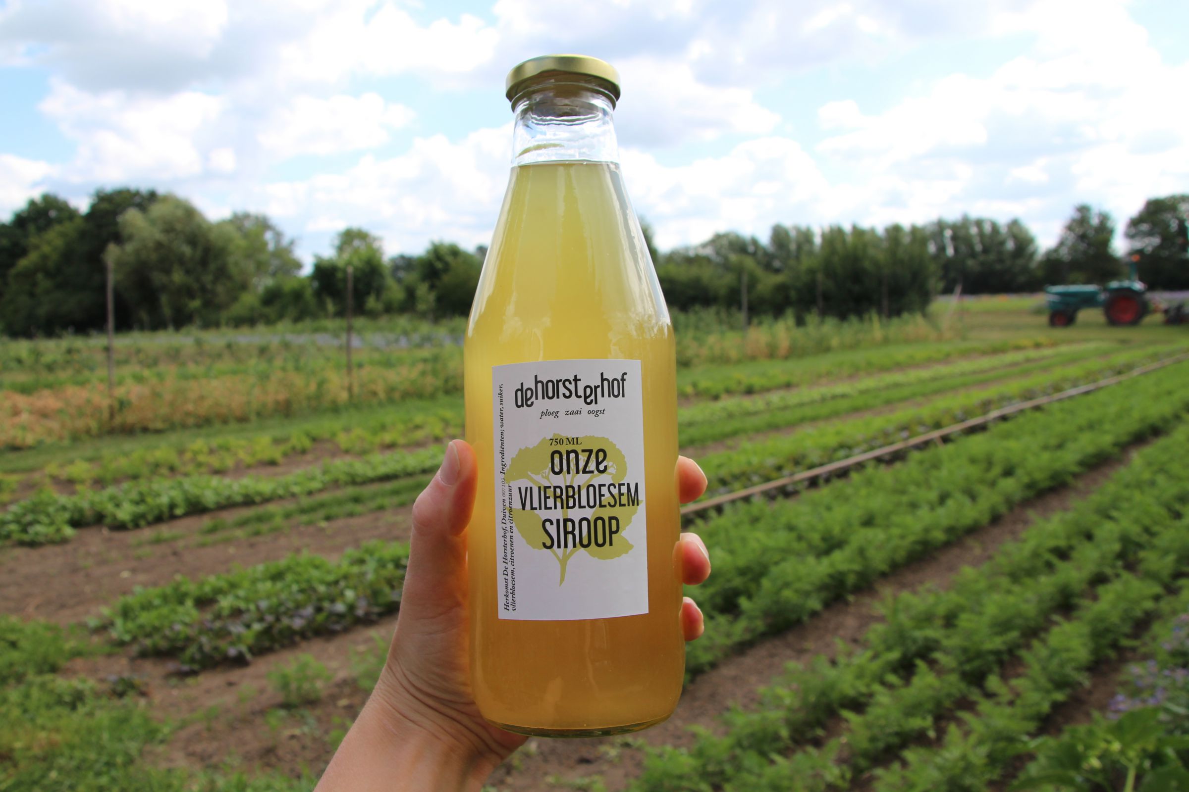
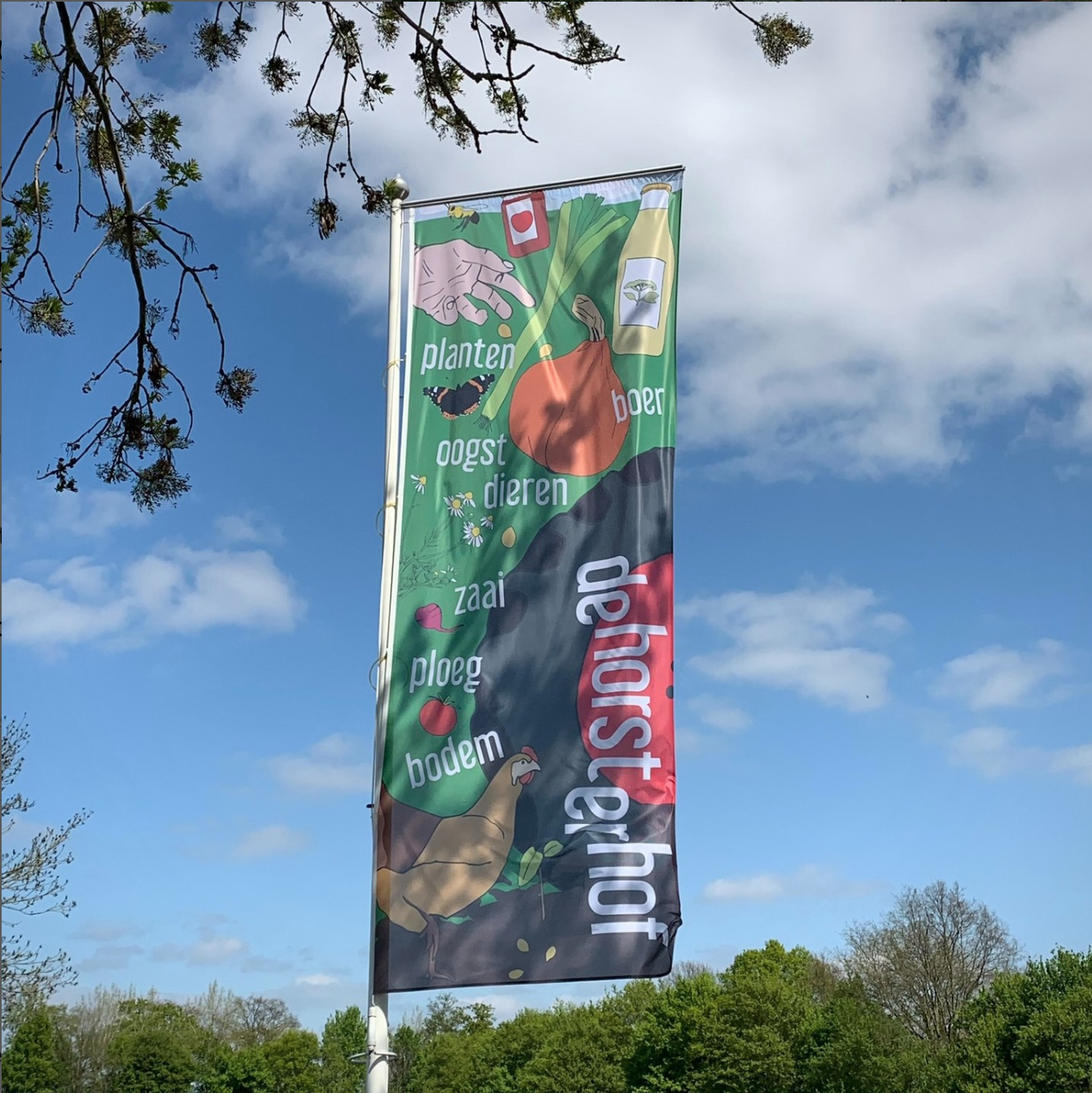
huisstijl typografie design grafisch ontwerpstudio arnhem graphic design duurzaam verbouwen fooddesign dynamisch biologisch eerlijk posterontwerp logo logontwerp huisstijl Annelou van Griensven Anne-Marie Annemarie Geurink beeldessay fotografie documentaire
huisstijl typografie design grafisch ontwerpstudio arnhem graphic design duurzaam verbouwen fooddesign dynamisch biologisch eerlijk posterontwerp logo logontwerp huisstijl Annelou van Griensven Anne-Marie Annemarie Geurink beeldessay fotografie documentaire flyer folder ontwerp communicatie
huisstijl typografie design grafisch ontwerpstudio arnhem graphic design duurzaam verbouwen fooddesign dynamisch biologisch eerlijk posterontwerp logo logontwerp huisstijl Annelou van Griensven Anne-Marie Annemarie Geurink beeldessay fotografie documentaire flyer folder ontwerp communicatie verbouwen boerderij horsterhof duiven biologisch signing
Flyer Algemeen
huisstijl typografie design grafisch ontwerpstudio arnhem graphic design duurzaam verbouwen fooddesign dynamisch biologisch eerlijk posterontwerp logo logontwerp huisstijl Annelou van Griensven Anne-Marie Annemarie Geurink beeldessay fotografie documentaire flyer folder ontwerp communicatie
Flyer groentenpakket
huisstijl typografie design grafisch ontwerpstudio arnhem graphic design duurzaam verbouwen fooddesign dynamisch biologisch eerlijk posterontwerp logo logontwerp huisstijl Annelou van Griensven Anne-Marie Annemarie Geurink beeldessay fotografie documentaire flyer folder ontwerp communicatie verbouwen boerderij horsterhof duiven biologisch signing

DE HORSTERHOF

THE 'HORST' (HURST) FORMES THE BASIS AND DNA FOR THE HOUSE STYLE OF ORGANIC FARM THE HORSTERHOF IN DUIVEN.

the DNA

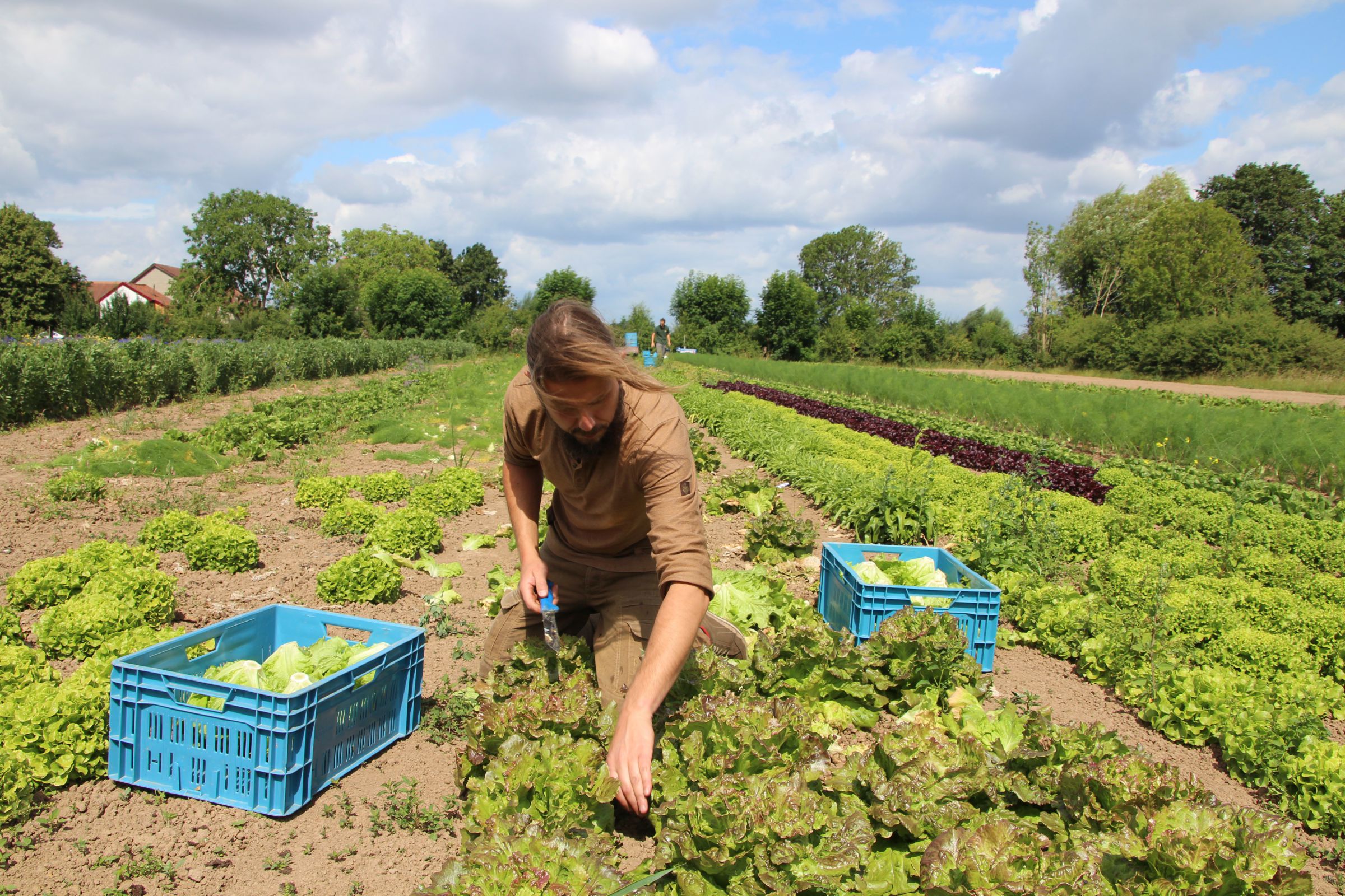
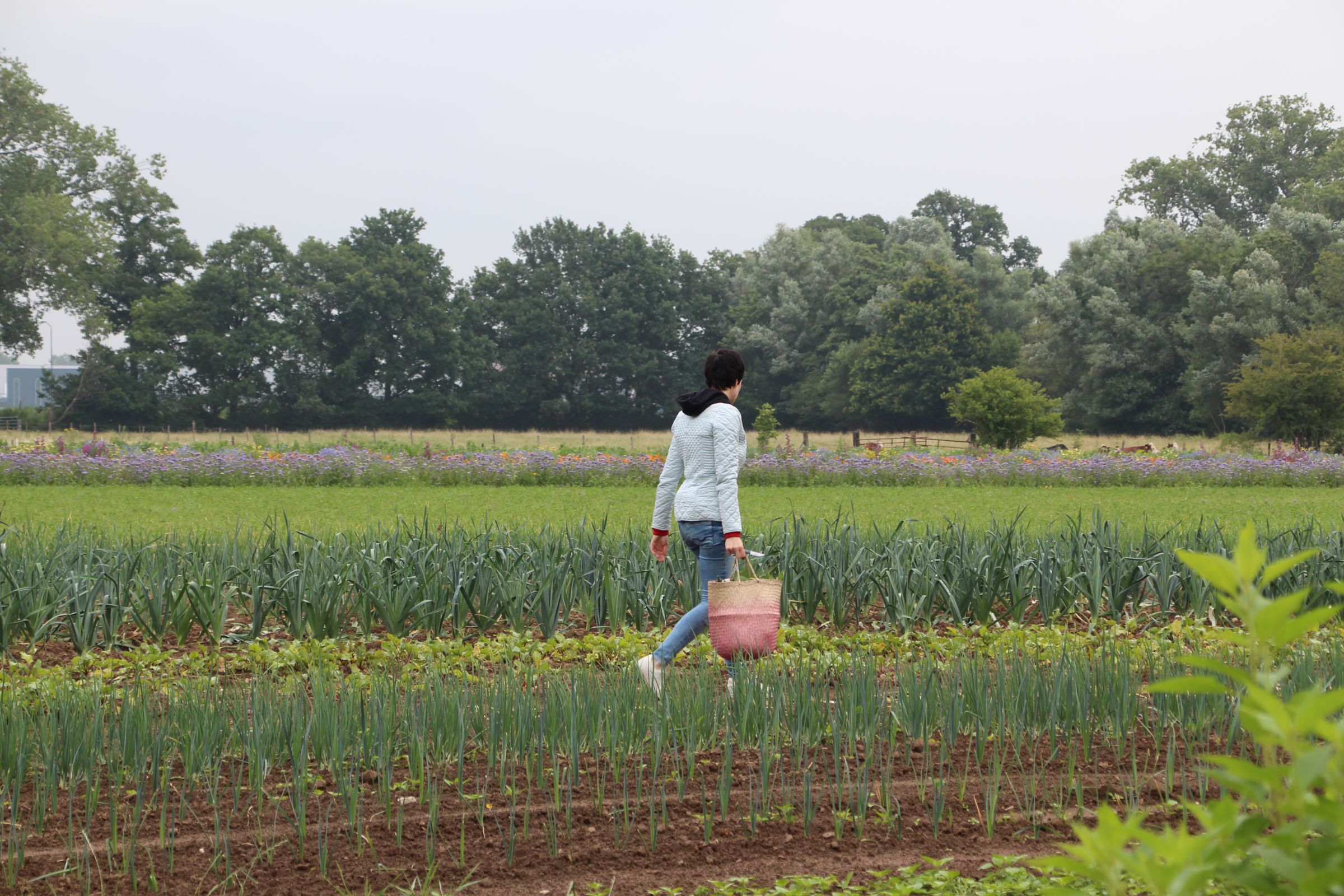
The Horsterhof is an organic farm in Duiven.
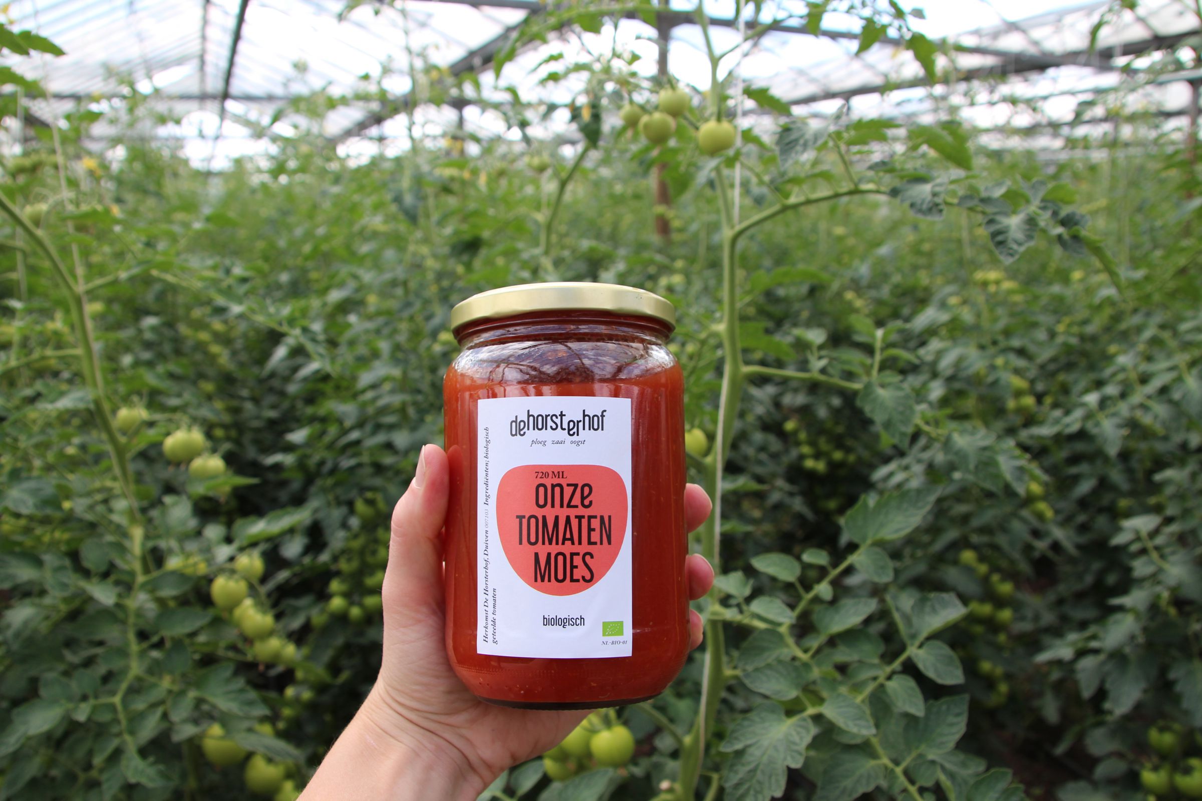
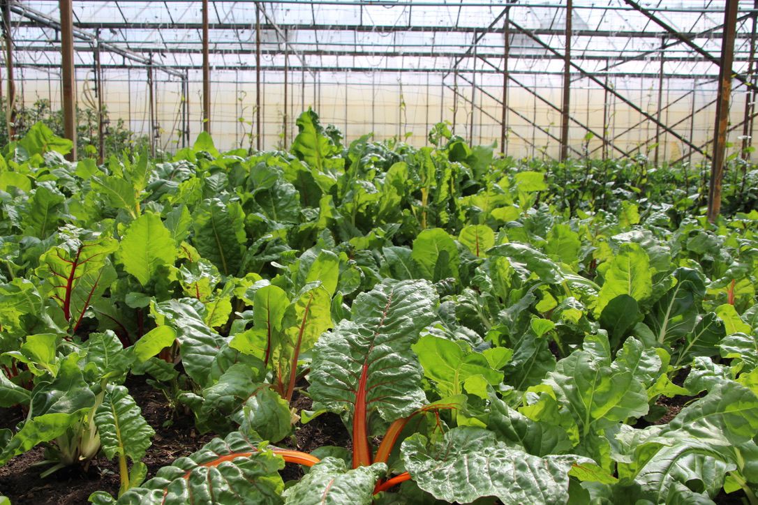
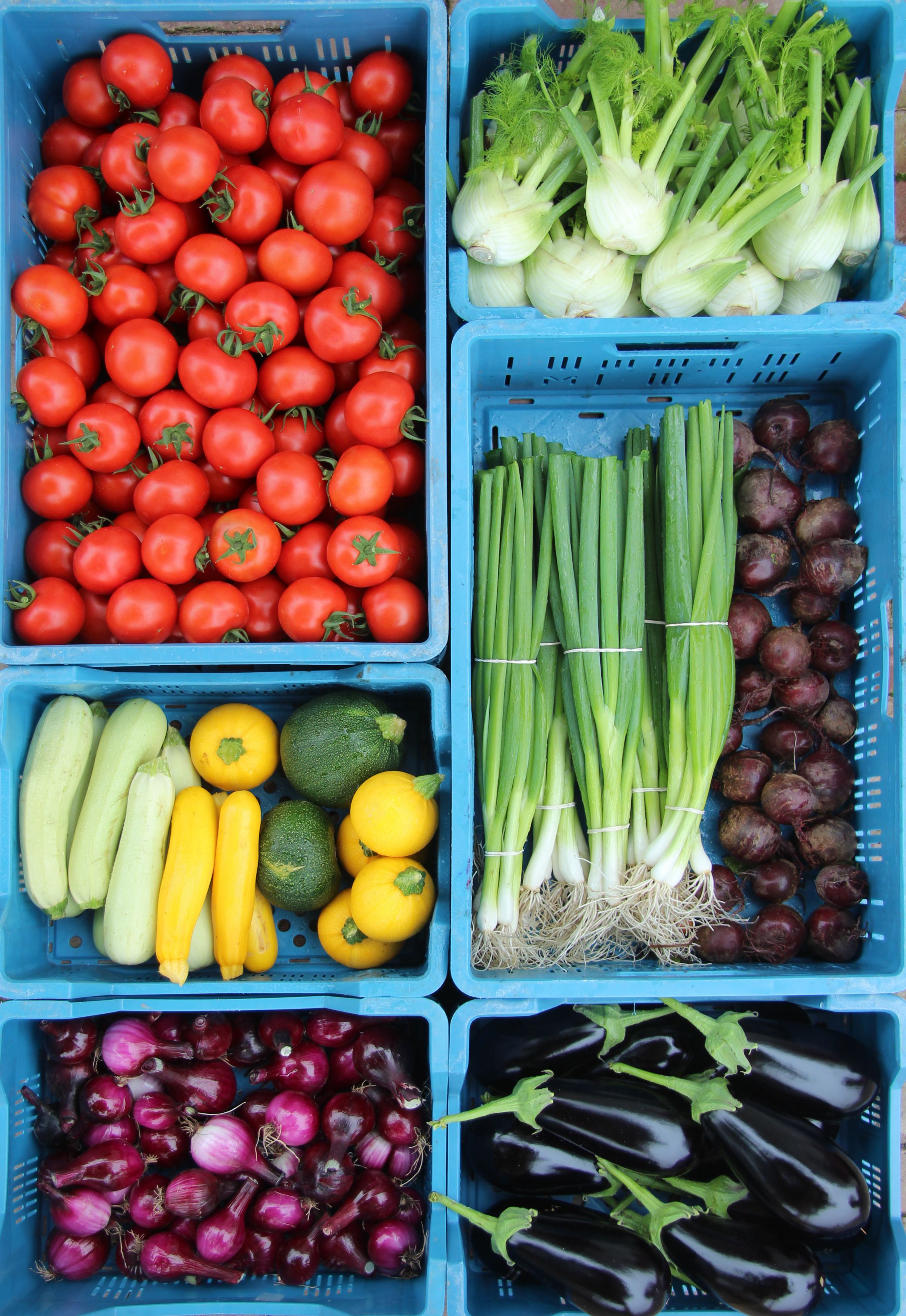
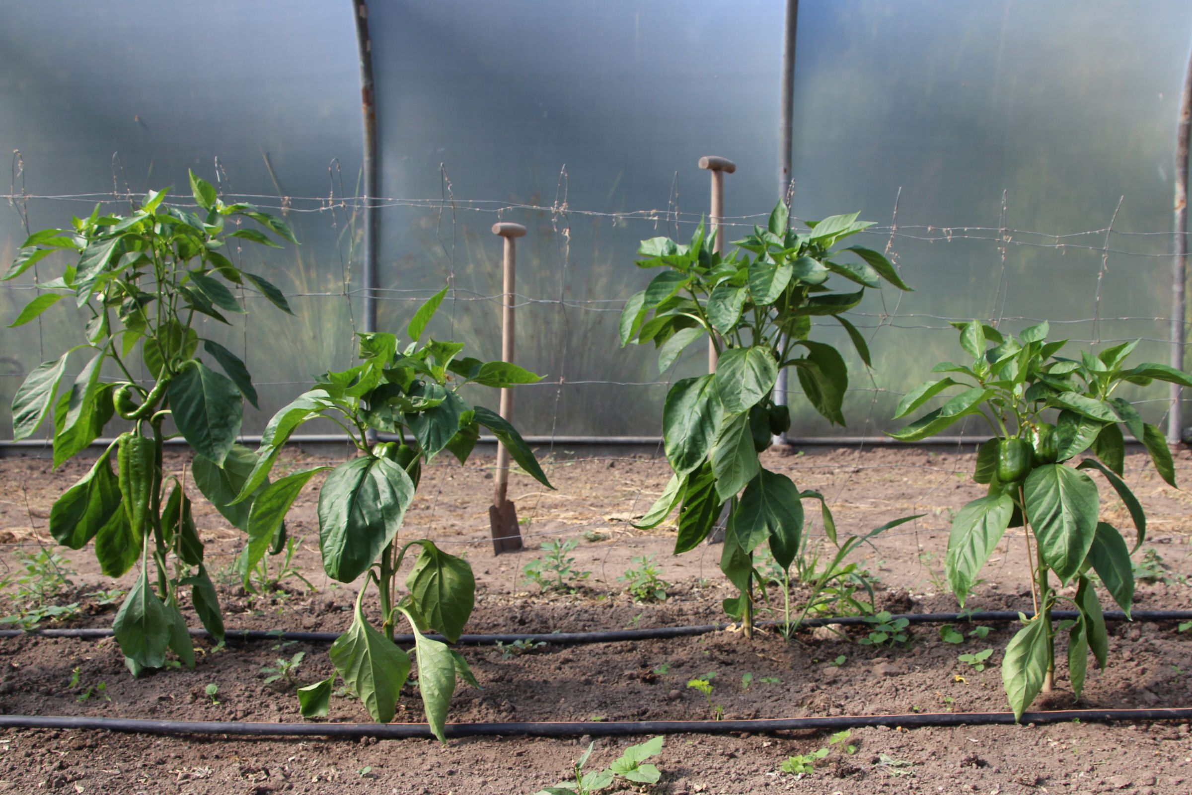
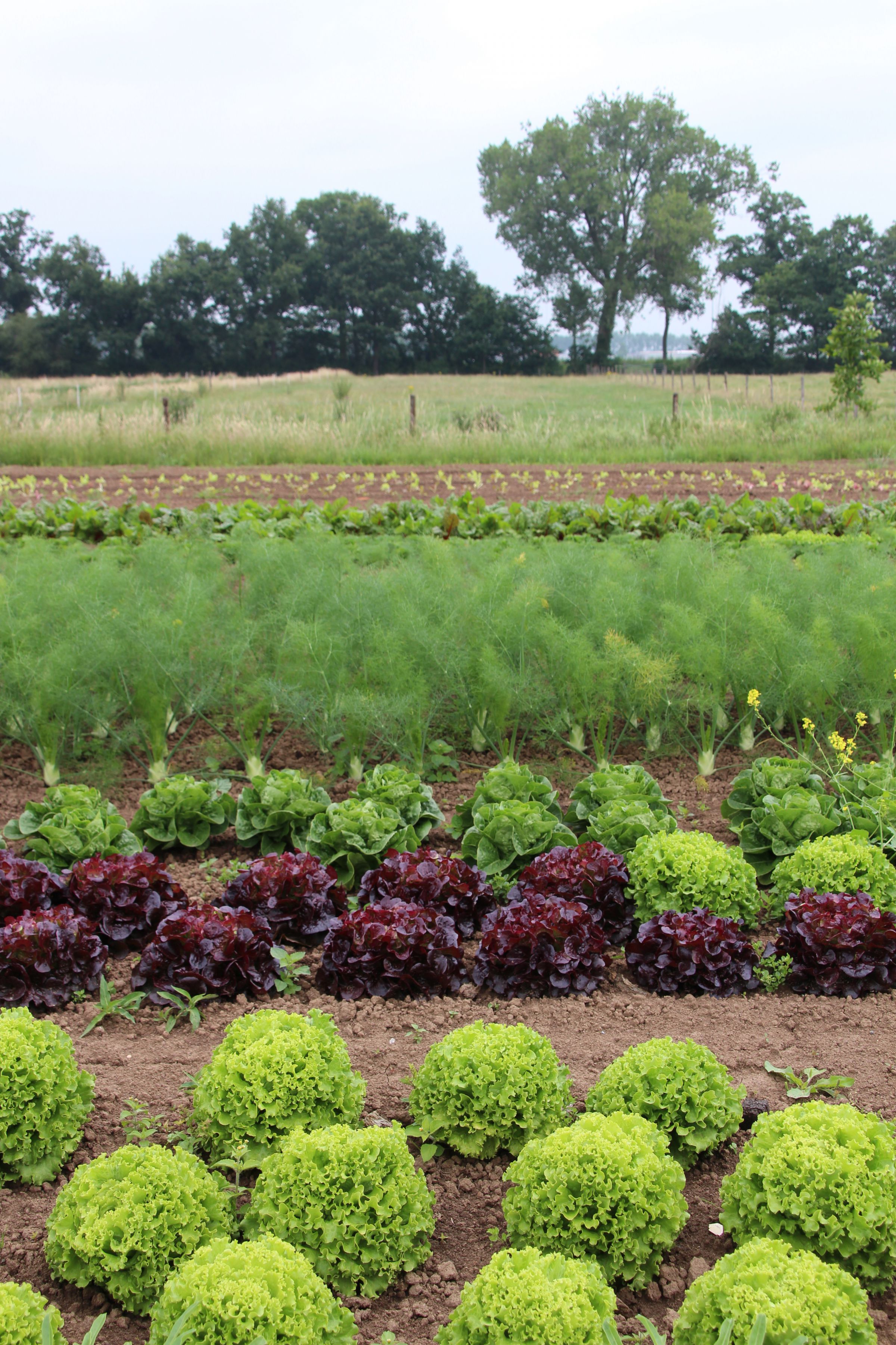
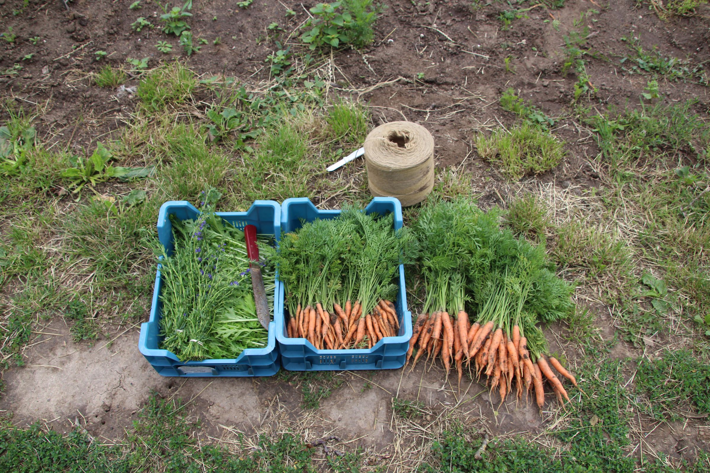
They deliver organic vegetables, meat, eggs and fruit directly to the consumer. The location and the land on which they farm are essential for the products that De Horsterhof provides. Geologically, this location is very suitable for agriculture, which is why this farm has been here for such a long time. 

Horst is a historical name for a raised area of land covered with brushwood or coppice. The 3 different soil types provide the ideal environment for farming. Sand, clay and loam soil.

Logo and house style are applied in various ways. The logo should therefore be bright and clear, and also communicate effectively. The basis is the location/DNA of the farm. 

The diversity of soil and hurst (elevations) is reflected in the typography of the logo. The quality of the soil is of vital importance for organic farming. This explains the diversity of products that come from this land. 


the identity

Logo and house style are applied in various ways. The logo should therefore be bright and clear, and also communicate effectively. The basis is the location/DNA of the farm. 

The diversity of soil and hurst (elevations) is reflected in the typography of the logo. The quality of the soil is of vital importance for organic farming. This explains the diversity of products that come from this land. 

the slogan

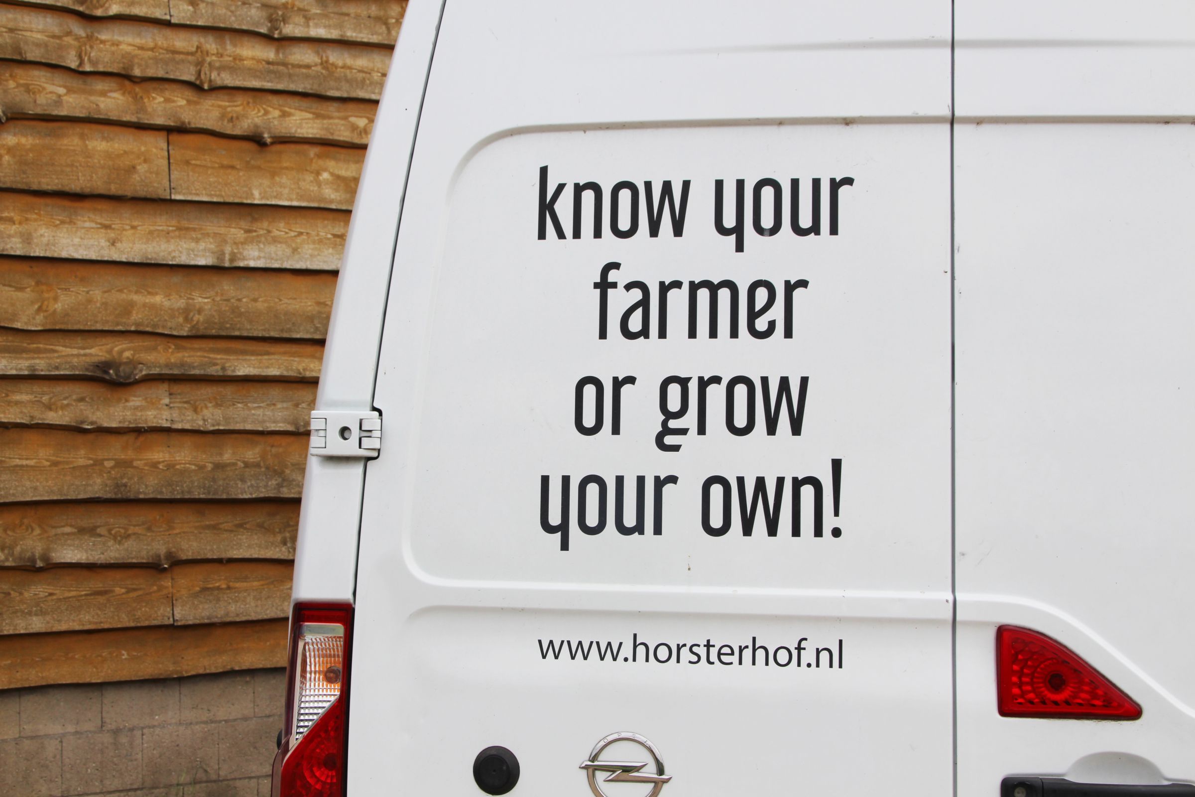
The slogan plough, sow, harvest reflects the farming process. Every aspect of agriculture is thus represented in the communication of the Horsterhof.


flyers

The same variations in elevation that are used in the logo are also used in the typography of the flyers. This emphasizes the dynamism of the land even more. The logo is used in black and white to maximize the contrast with photography or the background.

flyer van de boerderijwinkel met groentekratten en typografie


Photography

horsterhof verkoopt eigen honing van deze bijen

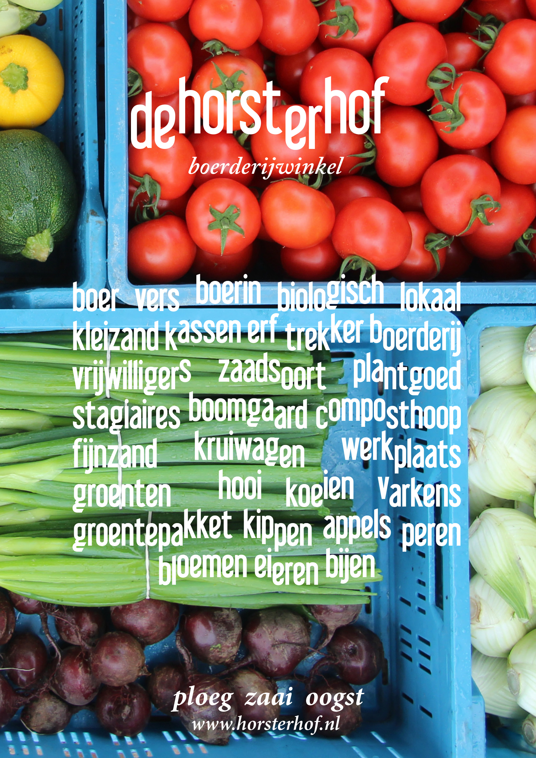
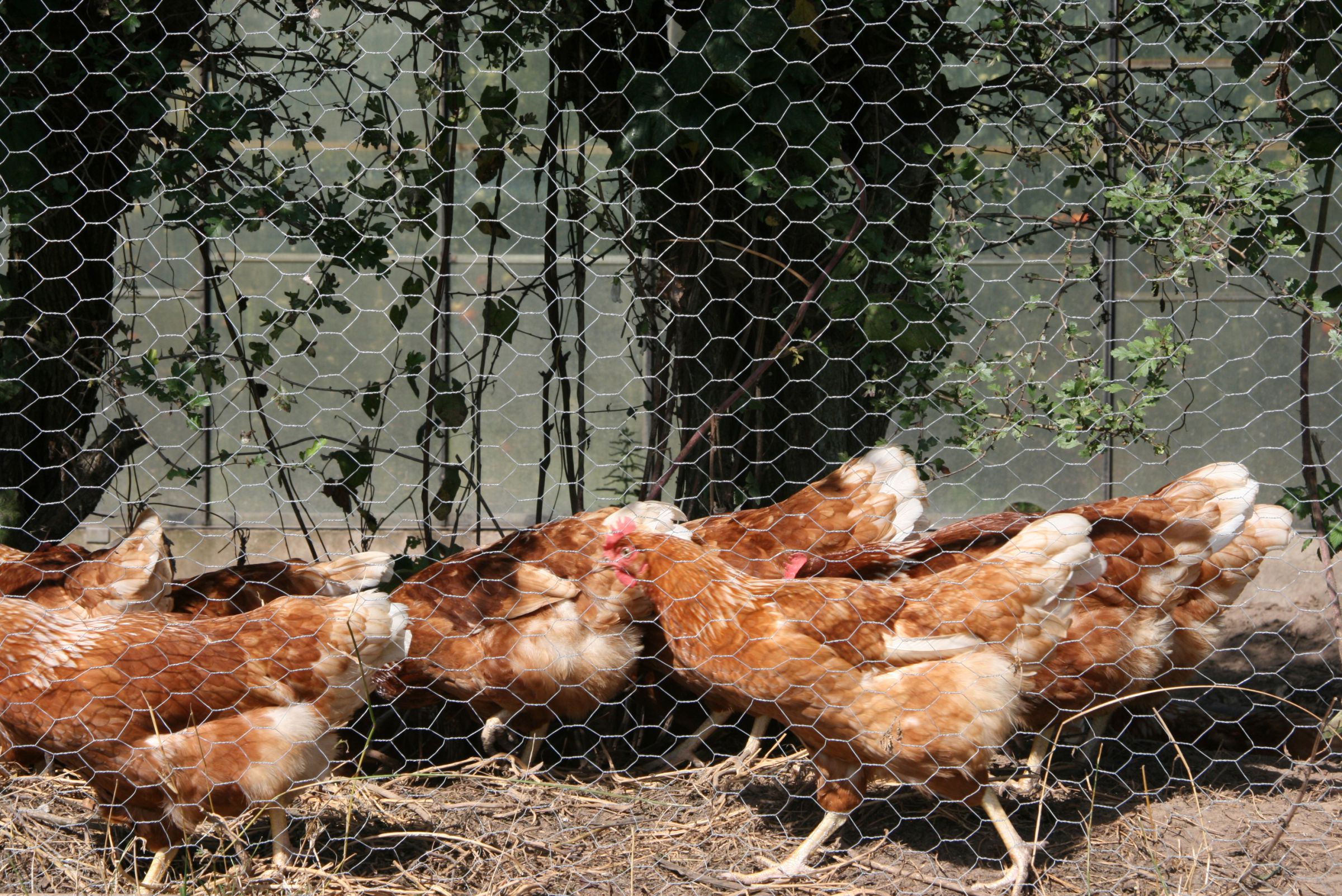
All photographs used in applications of the Horsterhof will have a horizontal line. This line refers to the diversity of the land and the idea behind the logo. 

stay up to date