PURPOSE FASHION & DESIGN FESTIVAL ARNHEM CAMPAIGN
An online and offline campaign for Fashion and Design Festival Arnhem.
Anne-Marie Geurink
+31 (0) 615111689
annemarie@devormforensen.nl
Annelou van Griensven
+31 (0) 644688094
annelou@devormforensen.nl
Transformatorplein 6
6827 AC
Arnhem
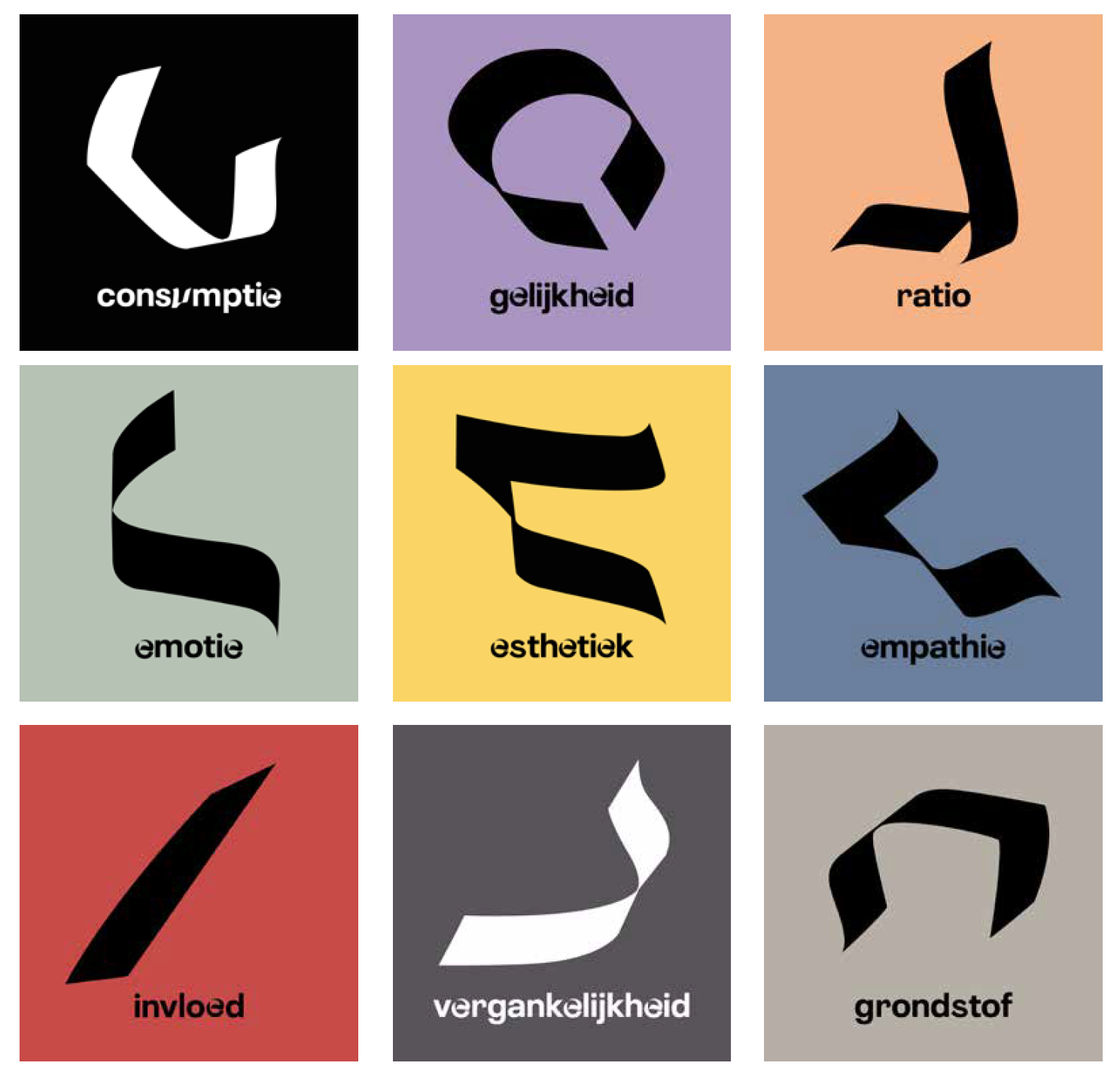
Every year FDFA (Fashion Design Festival Arnhem) creates a one-month event. Exhibitions, fashion shows, performances and events are organised. The work of artists and designers are given a platform. The content of this edition of FDFA was based on 10 dimensions that are connected to the Kabbalah. The dimensions are, consumption, equality, emotion, aesthetics, transience, ratio, influence, empathy, raw material and thoughts. FDFA is a local festival with a broad reach that develops and directs on the substantive themes, connects and communicates the story for a wide range.
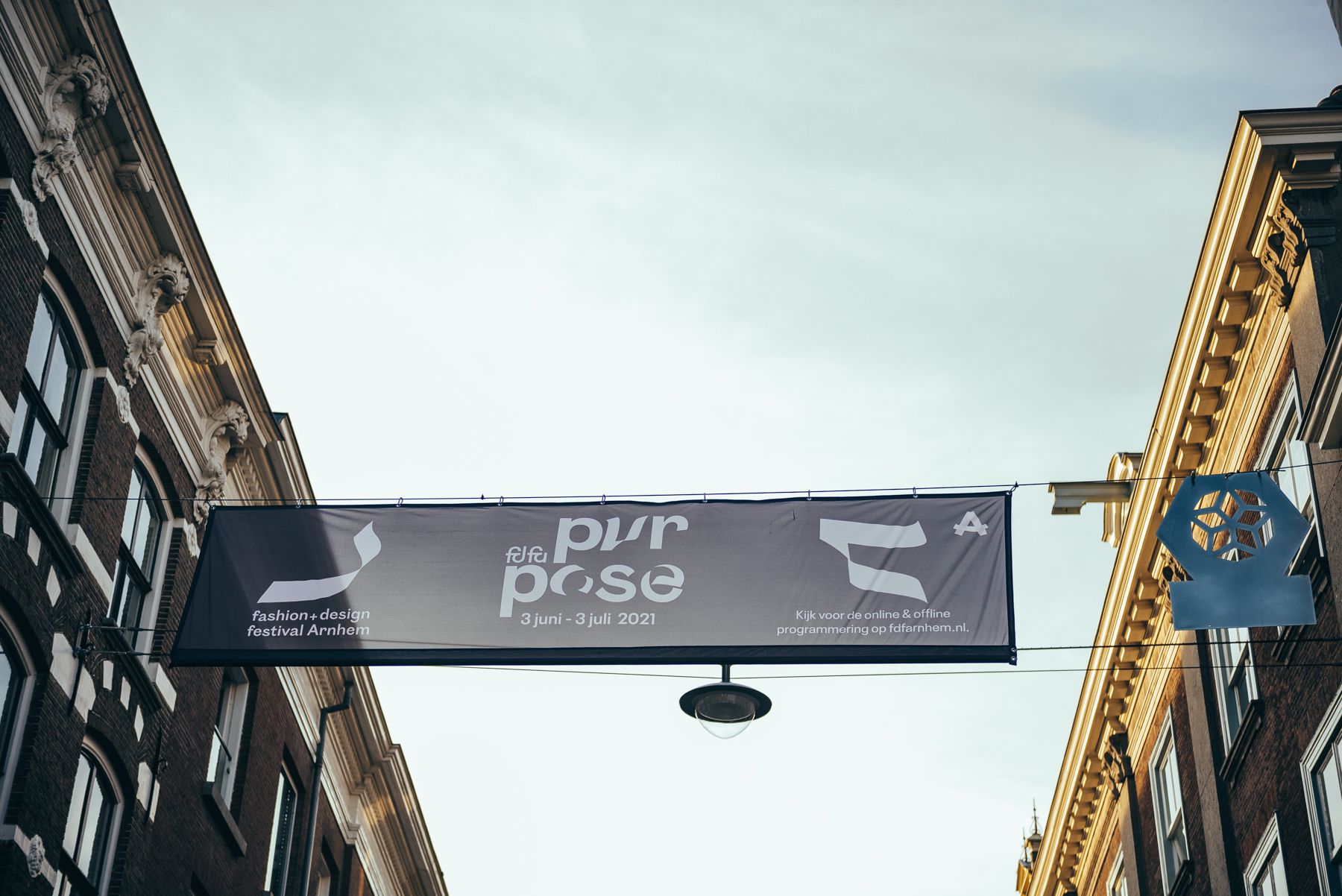
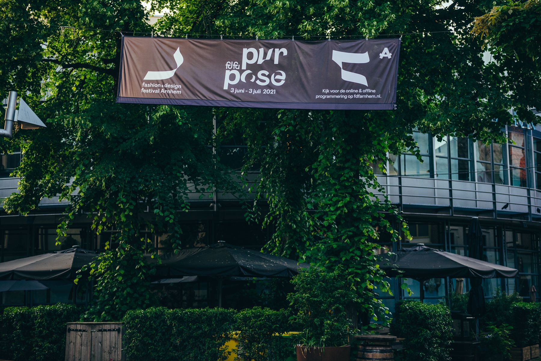
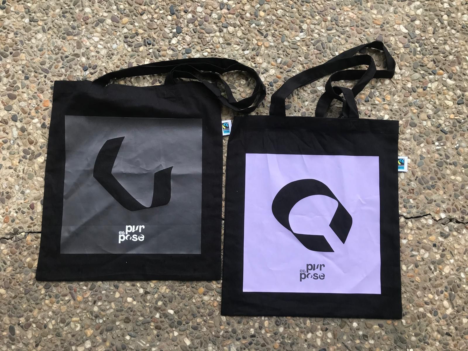
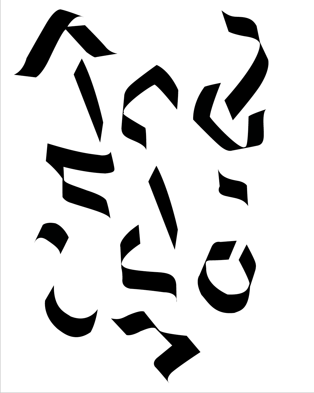
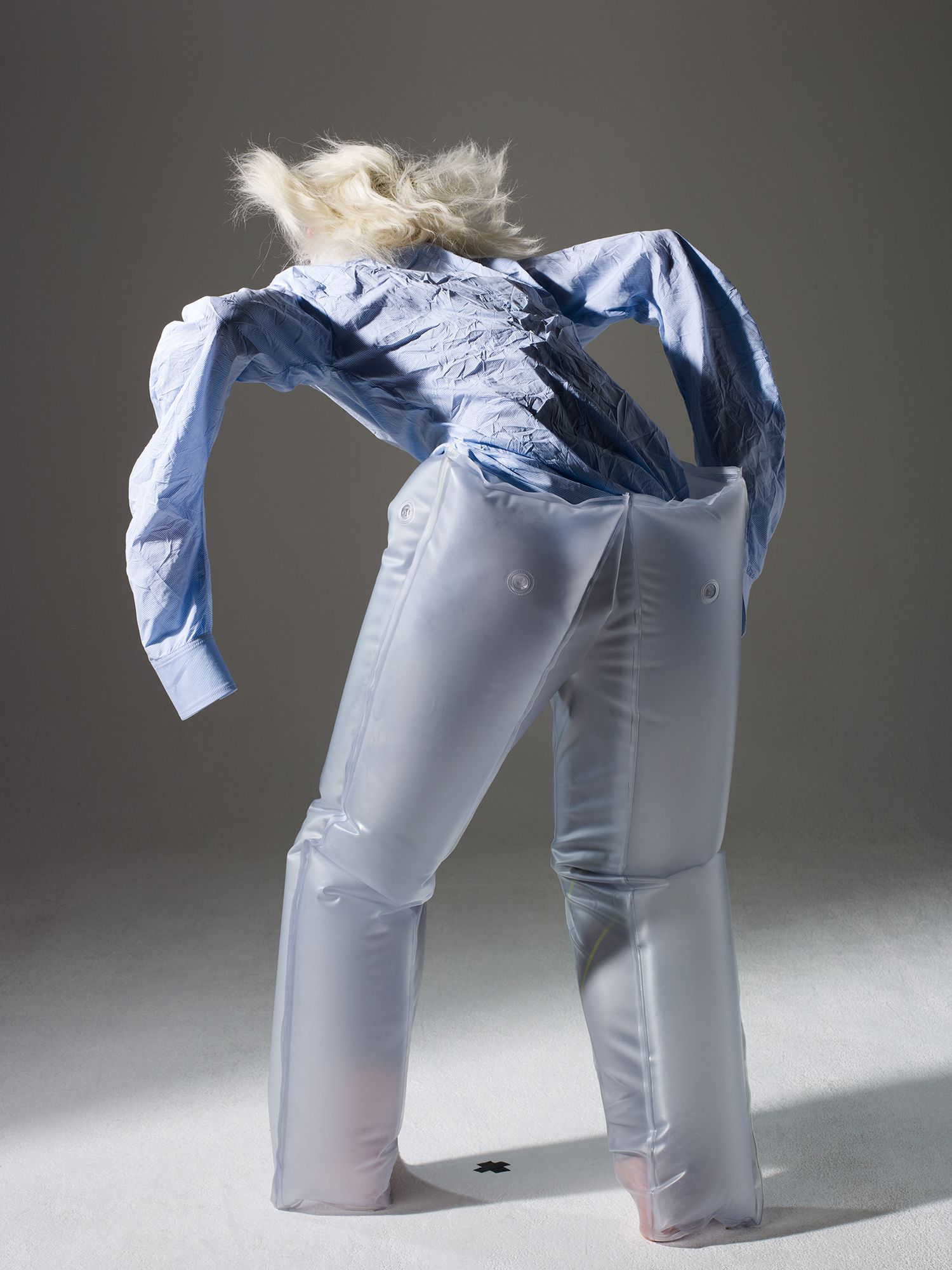
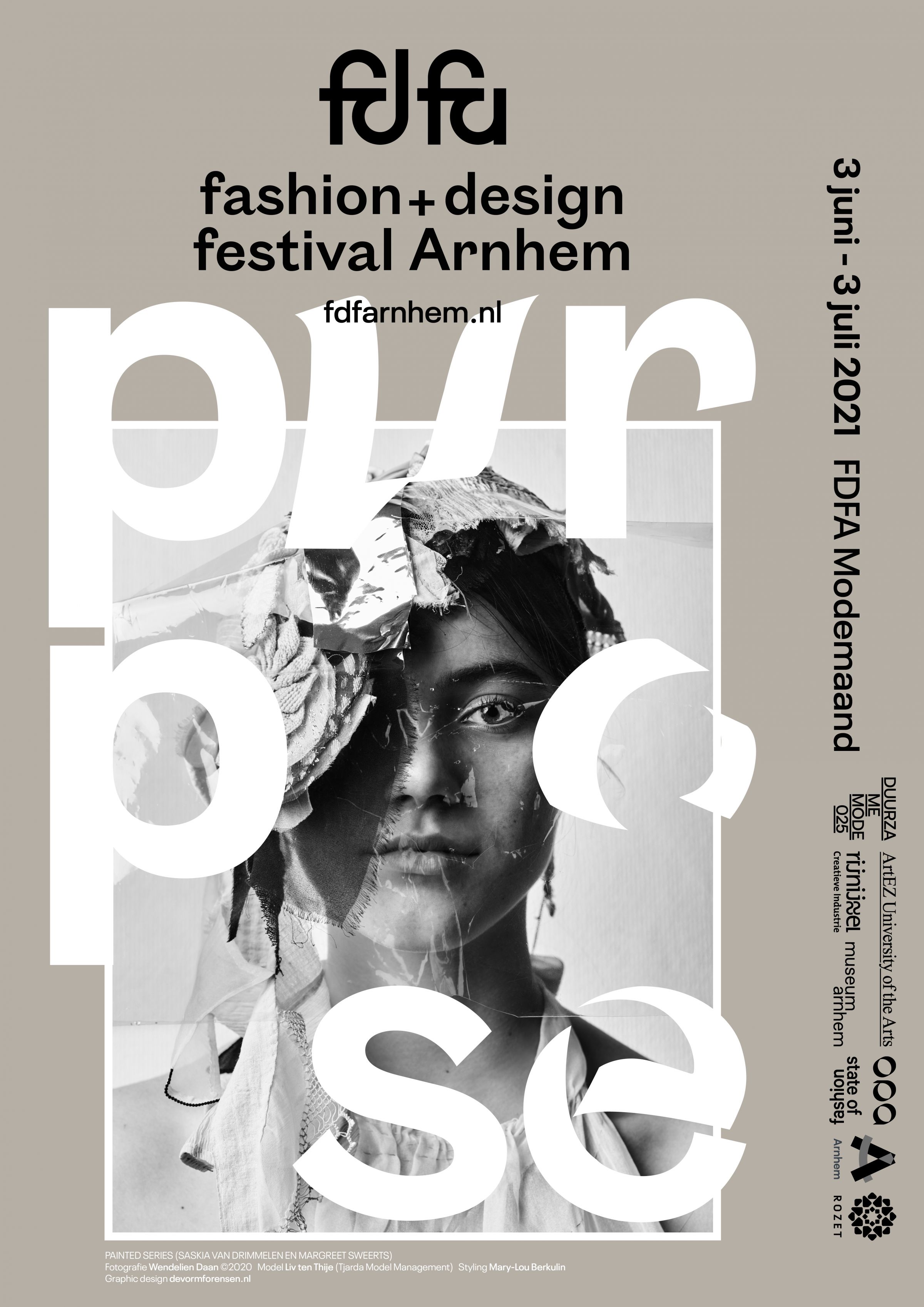
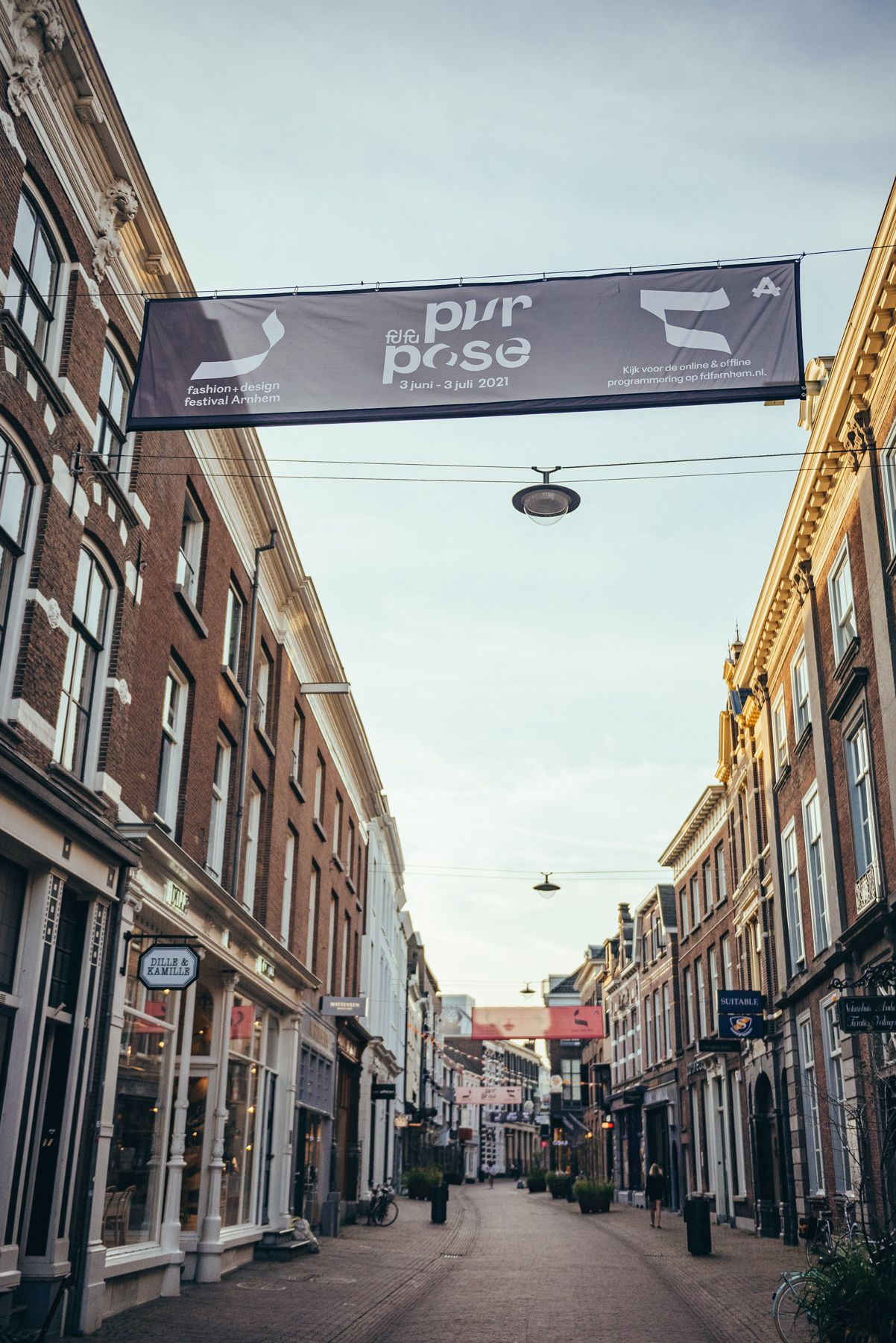
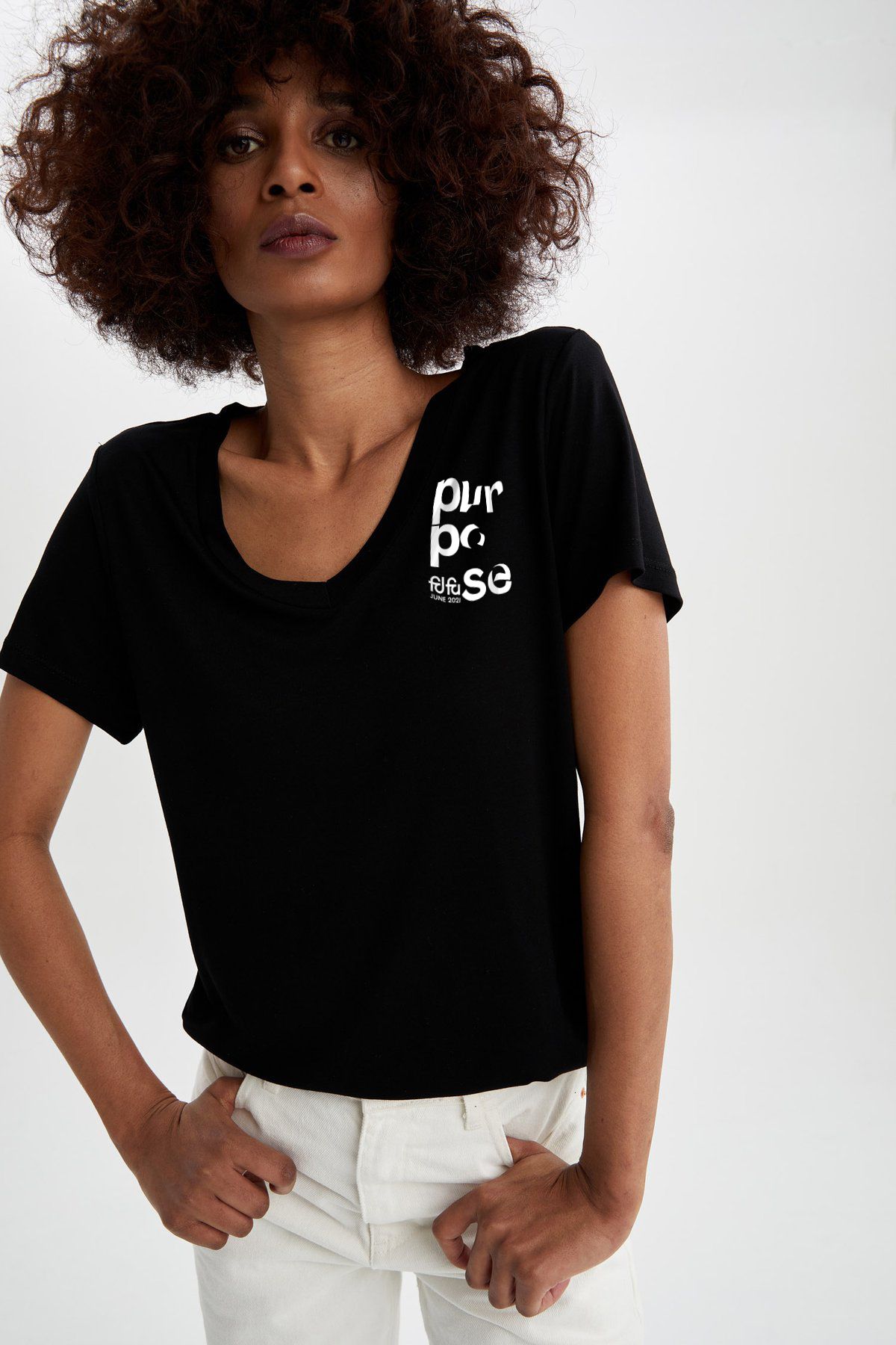
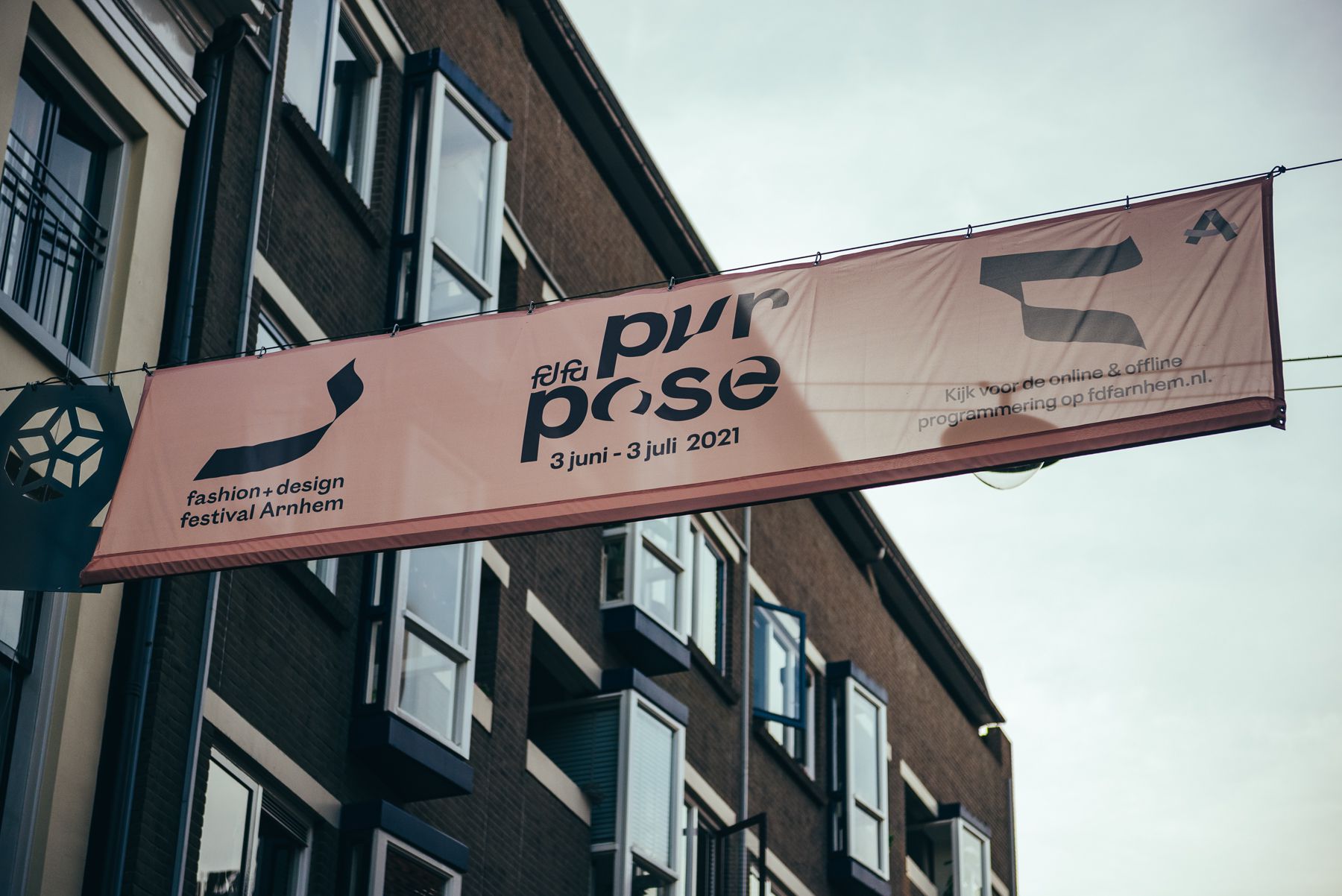
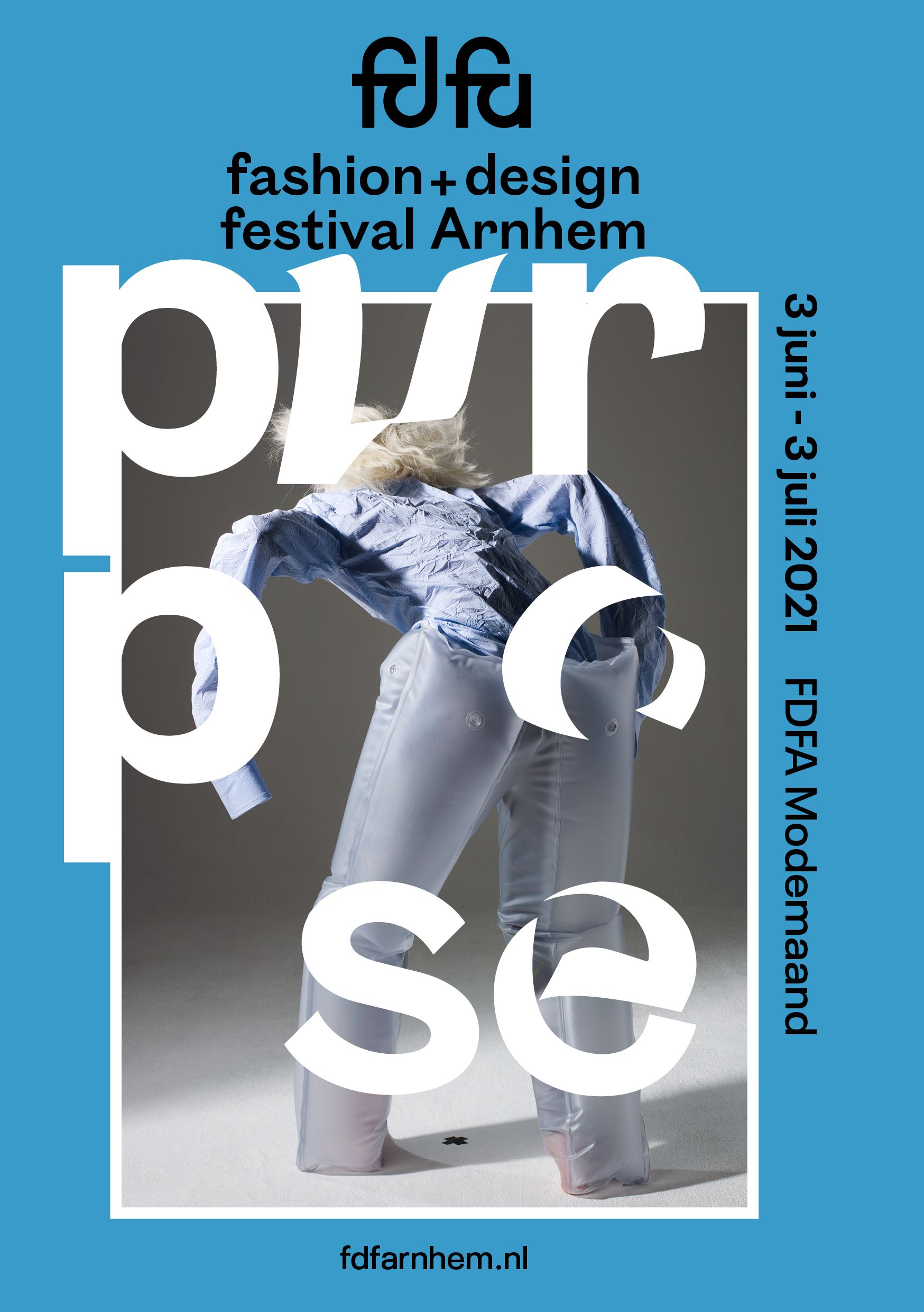
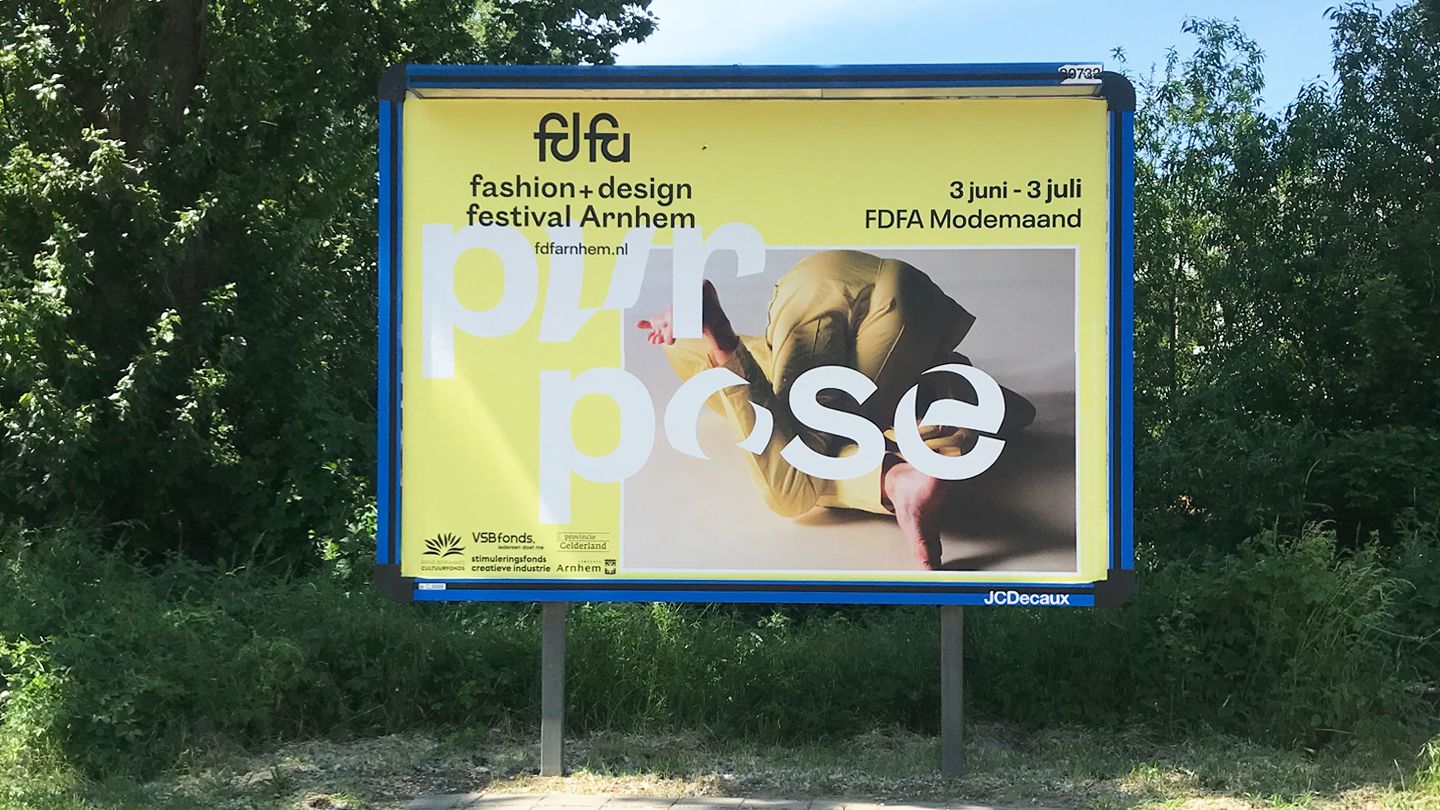
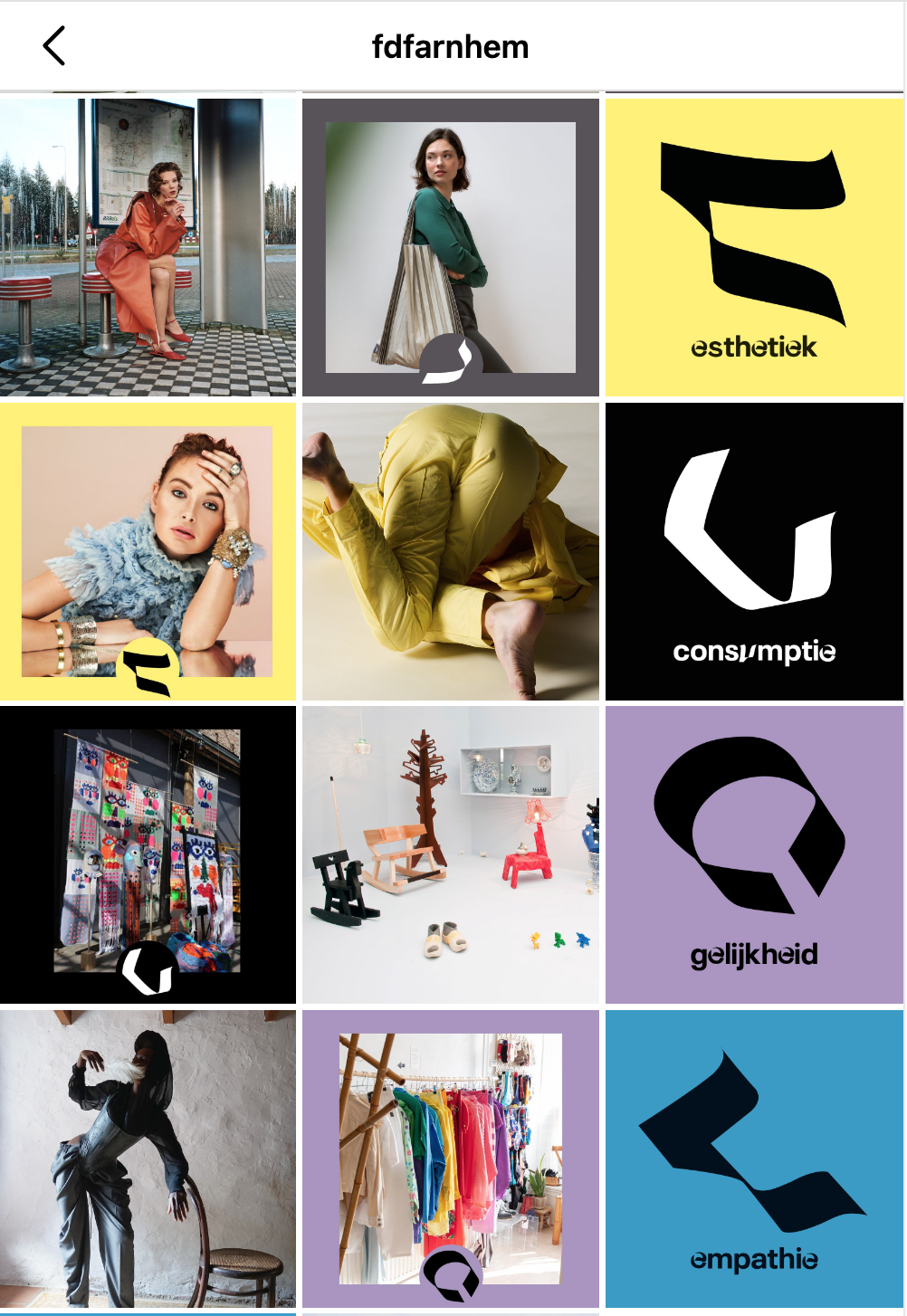
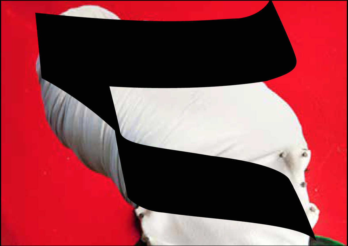
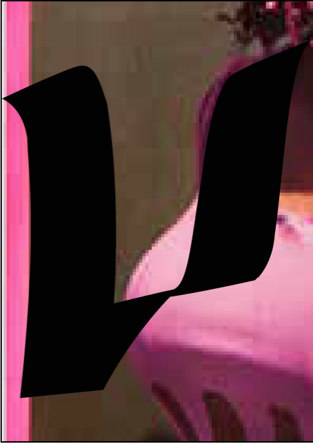
The general theme and fundamental part of this edition 'purpose' is based on Sefirot, Kabbalah. To underline this, we thought of a strong visual connection. Therefore, we developed a concept for the visuals of this festival, they were based on Hebrew script. The graceful shapes within the calligraphy were used to deduce towards new symbols and letterforms. We tried to find a honest and visual language that is based on cultural elements. We tested the forms related to the Hebrew script by people with diverse ethical backgrounds. The festival consists of various dimensions where artists and designers were linked. It was very important that it was clear at a glance which artist/designer matched which dimension. So, dimension, color, symbol were connected in one image. We developed a brand with different elements that could be implemented in different out-comes. In online and off-line communication, we choose three different photographs captured by Wendelien Daan. We made sure that the photos could be used with one of the 10 different colors and in portrait or landscape framework.
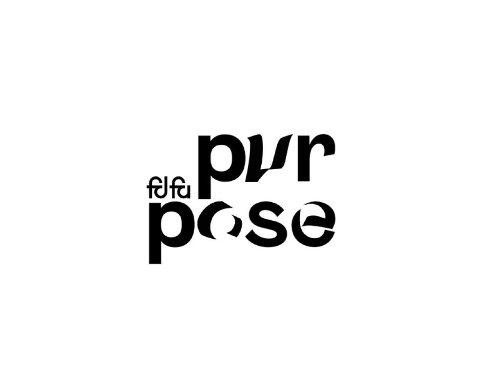
The calligraphic elements were used to develop letterforms in combination with the existing typefaces. Each dimension got its own color and calligraphic-symbol. They were used online to communicate about the dimensions. Every application within the campaign had one of the 10 colors. When the festival went online, we collaborated with a Jurriaan Hos who helped us with online dynamics in the campaign. With the motion graphics the visuals became completed. The calligraphic forms are moving like parts of textile in the space. For the video's we developed an introduction with an overview of all dimensions. Movies and images of the festival and dimensions: www.instagram.com/fdfarnhem/
As a studio we work for and together with people/organisations that feel the need to tell a story about sustainability or how to integrate social aspects within a design. Making this visible and communicate this towards a bigger audience is our task as graphic designers. We saw that creating a compact context with a visual language that is flexible but distinctive, works to involve the audience.
More information about Fashion Design Festival Arnhem, check the website.

